
RGB vs. CMYK: Why Your Printed Packaging Colors Look Different Than Your Screen
A design file looks right on screen, then the proof comes back and the blue is duller, or the orange leans brown. This isn’t a printing error most of the time. It’s a color model mismatch that started long before the file went to press.
RGB vs. CMYK: The Basic Difference for Packaging Printing
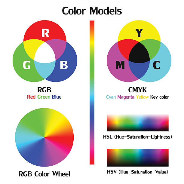
Screens build color with light. Red, green, and blue pixels combine at different intensities, and because light adds up to white, RGB can produce colors — neon greens, electric blues that ink physically can’t match. Printing works the opposite way. Cyan, magenta, yellow, and black ink absorb light rather than emit it, so the printed result depends on how much light the material reflects back. That’s CMYK, and it’s a smaller color range than RGB by nature.
For most printed materials, this gap causes a mild, predictable shift: bright colors read a little more muted on paper than they did on screen. Flexible packaging tends to show a bigger version of that same problem. Printing on film rather than paper changes how light bounces off the surface, and depending on the film’s finish and clarity, that shift can be more noticeable than what shows up on a cardboard box or a business card.
Printing Process Leads to Different Color Results
Most custom pouches are printed using gravure or flexographic printing, not the digital or offset processes used for a lot of paper products. Gravure applies ink from engraved cylinders, and flexo applies it through raised plates — both transfer ink to film differently than a digital press transfers ink to paper. The dot pattern, ink viscosity, and the way ink sits on a non-porous film surface all affect how a given CMYK value ends up looking once it’s printed.
A CMYK build that looks accurate on a digital proof can shift once it runs through gravure or flexo, simply because the two processes lay down ink differently. Designers working from a general CMYK reference chart, without factoring in which process the pouch will actually run on, end up with proofs that read a shade off from what was approved on screen.
Film Material Causes Color Distortion
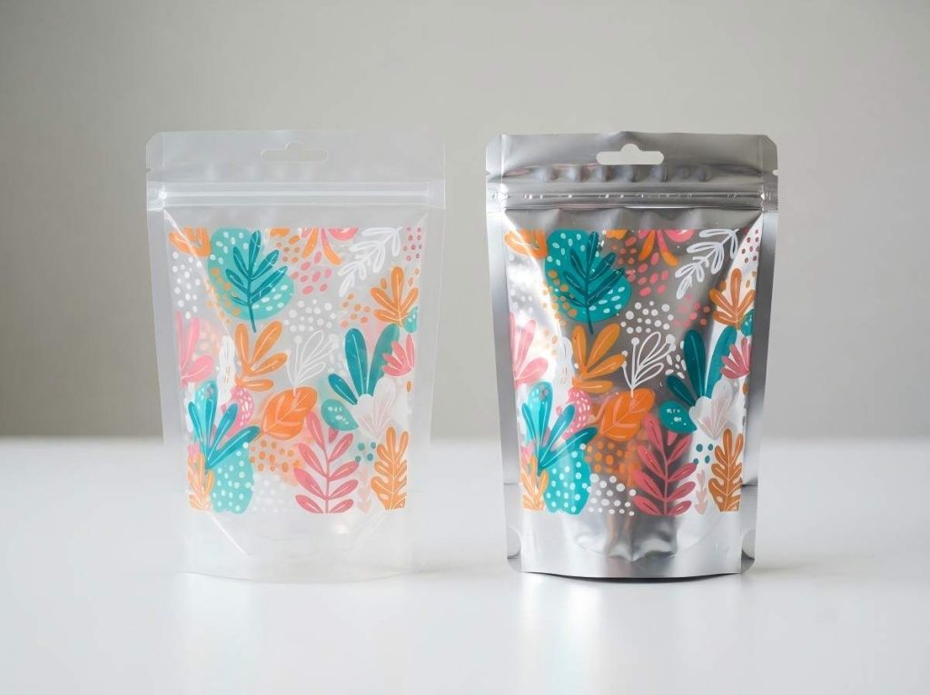
Paper reflects light fairly evenly across its surface, which is part of why CMYK colors behave predictably on it. Film doesn’t work the same way. Clear film is mostly transparent, and metallized film reflects light in a way that throws color off rather than showing it accurately. Printing CMYK ink directly onto either surface tends to produce colors that look washed out, gray, or inconsistent.
The standard fix is a white ink underprint — a layer of white ink printed first, underneath the CMYK colors, so there’s a consistent, opaque base for the color to sit on. Without it, the same blue that looks clean on a paper proof can turn flat or slightly green once it’s printed on a clear or metallized pouch.
Surface Finish Leads to Different Visual Effects
The surface finish applied after printing changes how the eye reads the same ink. Gloss laminate reflects light directly, which makes colors look more saturated and brighter. Matte laminate scatters light instead, softening the same colors so they can look darker or less vivid, even though the underlying CMYK values haven’t changed.
Brand colors that need to stay consistent across different SKUs or packaging formats run into this most often. A logo color approved on a gloss sample won’t necessarily look identical if a different product line uses a matte finish. Locking in the finish before finalizing color values keeps the CMYK build from needing adjustments later to compensate for how the laminate changes the appearance.
How to Avoid Color Mismatches Before Production
A few habits at the design and proofing stage catch most of these issues before they turn into a reprint.
- Provide a Pantone reference alongside the CMYK build. CMYK numbers alone can shift slightly depending on the press and ink batch, so a Pantone reference gives the printer a fixed target to match against. The Pantone Matching System is the industry standard for this, and most packaging printers can work from it directly.
- Request a physical proof on the actual film and finish. A digital proof on a monitor, or a printed proof on plain paper, won’t show how gravure or flexo printing renders the color. It also won’t show what a white ink underprint or a matte laminate will do to it. Confirming the film type and surface finish before signing off on final colors keeps the approved proof and the production run aligned.
As a custom packaging manufacturer, Shine Pack works through these details with clients before a full run starts. Feel free to reach out if a project is at that stage.